
Kirchner is an impressionist painter that uses a variety of printing methods to create his unique pieces of work. He has produced self-portraits; nudes; man and nature; anti-establishment; portraits; city-scapes and illustrations. His incredible style stood out to me because his colours are bold and so are his lines.
I first came across his work when i went to Hamburg, Germany in 2014. It was an amazing trip (my first trip abroad with just me and a friend!) and our visit to the Bucerius Kunst Forum was one of the highlights of the trip.
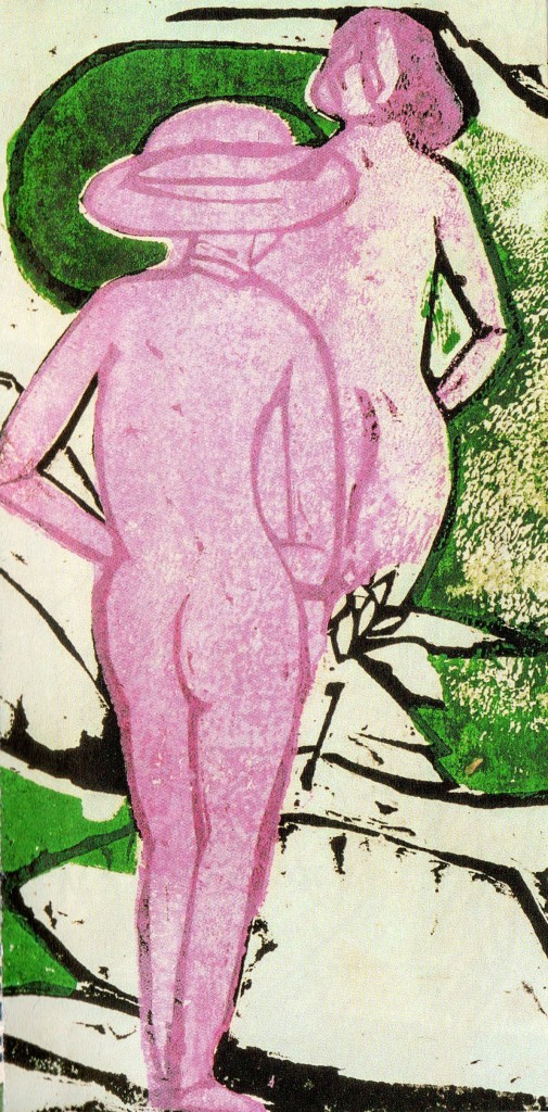
- Printed
- Dark colours are usually applied last. This does not seem to be the case this time.
- The marks are messy due to the ink that has been used to print the design with.
- The choice of outline for the people is intriguing. By using a darker shade of the same colour, the image is not as harsh as the section outlined in black.
- The texture the print process leaves aids towards the impression of skin. It allows the work to look ‘realistic’ whilst also being impressionistic.
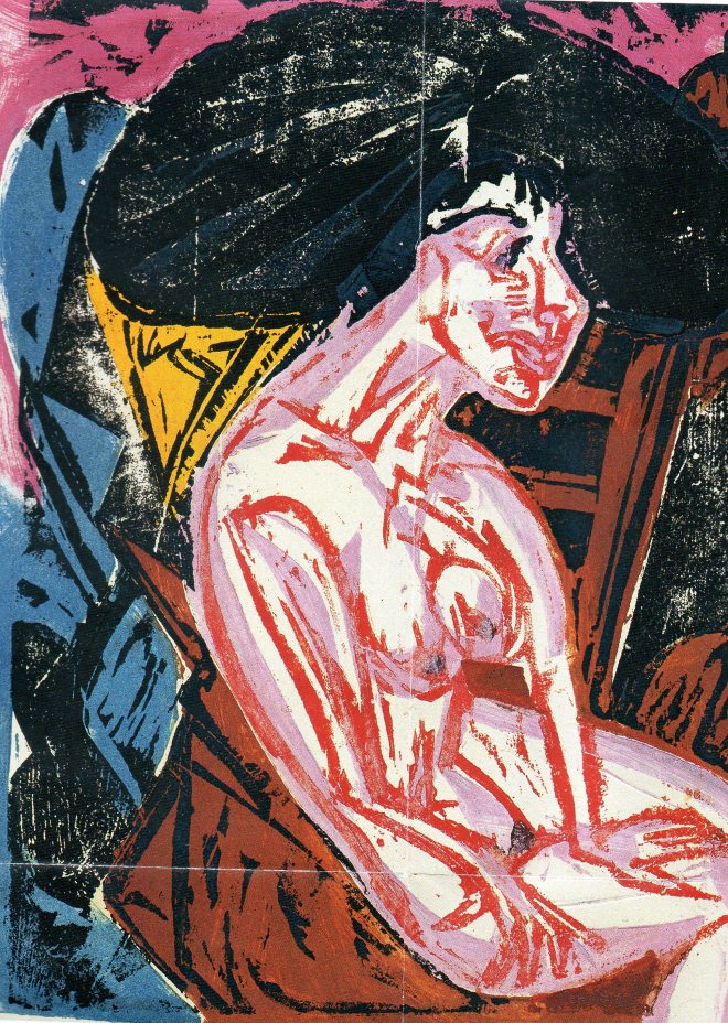
Die Geliebte, 1915. (Blatt 2 aus der Folge Peter Schlemihls wundersame Geschichte)
- The method looks painted rather than printed. This is created by constantly overlapping layers of ink; it also depends on the the marks that have been carved into the wood block.
- Contrasting colours create harsh lines.
- I like the impressionistic style because it is influenced by reality but takes on its own appearance and personality. I would love to have seen each section of this image as each layer was printed.
